Tired of Low Pin Clicks? Here’s How to Create Pinterest Pins That People Can’t Resist Clicking On!
Are you getting high impressions on Pinterest, but they’re not converting to clicks? If so, it may be time to reconsider your pin designs.
You are not the only one struggling to convert your Pinterest Pin impressions into clicks. While auditing our client’s Pinterest accounts, we often see many of them facing the same problem.
These clients optimize their profiles, boards, titles, and descriptions perfectly, resulting in good impressions for their pins. However, those impressions do not convert into clicks.
So, what goes wrong with their pins?
While their pinning strategy and optimization are perfect, their pin designs aren’t optimized for Pinterest.
If you want to determine why you are getting low pin clicks and learn how to create impressive, optimized pins that get clicked on Pinterest, read this article until the end.
Why Your Pins Aren’t Driving Clicks?
First, you need to find the reason why you are not getting clicks. Is it because of your pin design or something else?
If you have been inactive for a while and haven’t posted on Pinterest, this will also lead your impressions and pin clicks to go down gradually as shown below.

For the above account, we posted one pin each day from January to February and stopped posting pins in March when the impressions were increasing. As a result, impressions continued to rise for a few days but gradually dropped within a month. This is normal and not a sign of being marked by a spam filter.
The spike in impressions in May occurred because one of our pins went viral at that time, but impressions returned to normal afterward. So, if you don’t publish pins regularly, pin clicks will be low as the impressions go down.
However, drastic overnight drops in stable impressions, such as your overall impressions per day being over 5000 for many months but suddenly dropping to 0 – 9 per day, and continuous low traffic after that point, are not normal. It’s a sign of your account being flagged as spam, and you need to recover your account from Pinterest jail first.
If your Impressions are good enough but your pin click rates are low, then the problem surely lies with your pin designs. Your pins aren’t bold and optimized enough to grab the attention of users.
Finally, if your pin clicks are ok but outbound link CTR is low, this can happen due to not having a bold enough call-to-action design or description that makes the user feel they need to check out the article or product.
6 Pin Creation Hacks That Entice People to Click
Pinterest is more of a visual search engine than a social platform. Users who use these platforms get an initial idea of the content and product from the images they see.
There are many other pins shown beside yours, and if your pins aren’t bold enough to stand out, users won’t notice them.
But it’s not that difficult if you follow these tips while creating your pins:
1. Optimized Pin Size
The first thing you should get right is your pin size.
You can create your pins in different sizes, but too small pins may get lost among other content, while overly large pins may get cut off.
Here are the key points for creating optimal image pins according to Pinterest’s standard image ad specs:
- Aspect Ratio: Use a 2:3 width-to-height ratio for images. This ensures your pins display correctly without getting cut off in people’s feeds.
- Minimum Size: The minimum recommended pin size is 200×300 pixels. This is the smallest size that ensures clarity and visibility.
- Optimal Size: The best size for pins is 1000×1500 pixels for maximum visibility. This size guarantees high visibility and better engagement.
So, 1000×1500 pixels is the optimal pin size for standard pins.
According to our analysis, long pins with 1000×2100 pixels(1:2.1 size ratio) also perform well for desktop users and are best for infographic-type content.
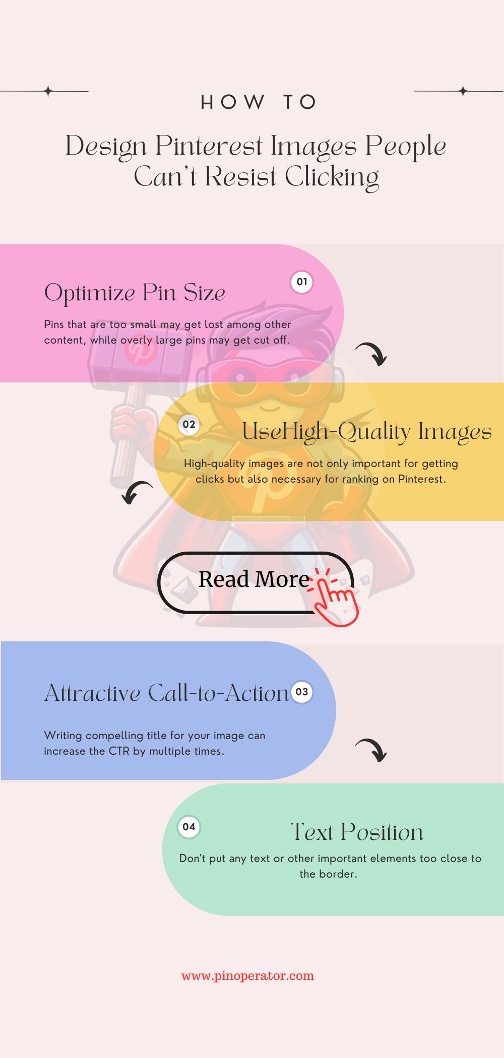
If your target audience primarily uses cell phones (which is highly likely) or if your content does not focus on infographics, design your pins using 1000×1500 pixels for maximum visibility.
2. Use Unique and High-Quality Images
The first impression is the best impression on Pinterest.
High-quality images are not only important for getting clicks but also necessary for ranking on Pinterest.
You can use images taken by yourself or stock images based on your goal.
For example, if your Pinterest account is for promoting your wedding photography, you should use images taken by yourself because the users want to get an idea of your work from your pins. Choose the best photo that’s taken by you and suitable for the topic.
For blogging niches, take suitable photos by yourself or use high-quality stock photos available. Here are some free sources for stock photos:
Use templates to give your pins a unique look from others. Tailwind is a good option for that since you can directly pull images from your article and easily customize it with the custom template designs available.
3. Attractive Call-to-Action And Title on Image
Writing a compelling title for your image can increase the CTR by multiple times. Use a title that works like clickbait or call-to-action. However, don’t mislead users if your article doesn’t actually match with content as it can get your account banned.
Listicle titles and negative titles get higher CTR than how-to titles.
For example, if your article is on “How to Make Money As A Teenager”, instead of writing the exact title on your pin, you can write something like:
- Stop Struggling and Start Earning- 5 Proven Ways to Become Rich At Your Teenage
- Are You Struggling to Earn As A Teenager? Check Out These 5 Essential Steps to Make More Money Now!
But don’t use fake clickbait titles like ’10 ways to become rich’ when your article only describes 5 ways. It’s unethical and can get your account flagged for spam.
However, it doesn’t always work, so A/B testing is necessary (check out the next point). Using the exact same title as your article is also okay sometimes since Pinterest can read the text on your pin to determine what your pin is actually about. So it will rank for the exact topic.
4. Font And Text Position
Many pin designers place the title too close to the edges of the pin. However, Pinterest recommends not to place important text or elements within specific margins for optimal visibility:
- 270 pixels from the top
- 65 pixels from the left edge
- 195 pixels from the right edge
- 790 pixels from the bottom
This doesn’t mean you must leave too much space on the edges. Just leave a little space for better visibility.
Another key reason for getting low clicks is using font colors or texts that are too similar to the background and very hard to see.
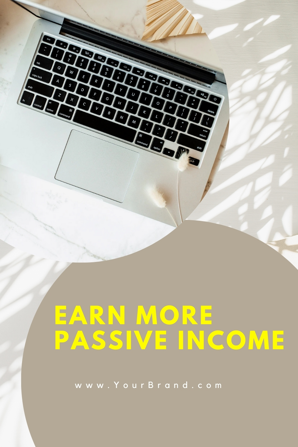
For example, take a look at Pin Designs 1 and 2.
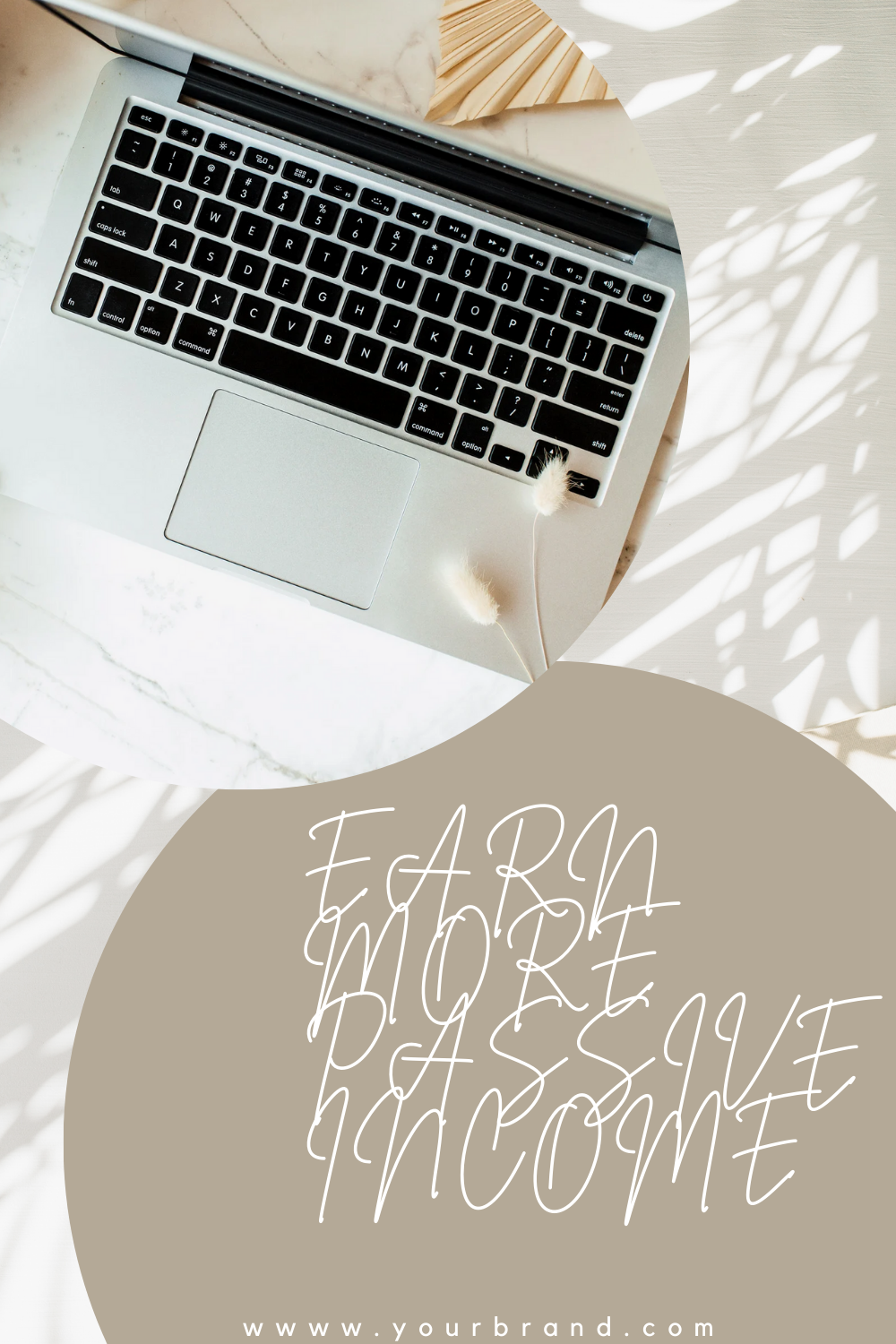
In pin Design 1, the font is difficult to read and, in fact, very uncomfortable for the eyes. The texts are placed very close to the bottom edge. Overall the font and text position make it a bad pin design.
Pin design 2 has the same background, image, and template design as pin design 1, but the only differences are in their font style, font color, and text position. In pin design 2, the title is easily readable, bold enough to draw the reader’s attention, and not too close to the bottom edge.
So, keep your pins clear and simple. Don’t make them full with too much text or visuals that could confuse people.
5. A/B Testing
This is one of the best ways to find out what brings you more clicks.
Experimentation is key to optimizing your Pinterest strategy and maximizing the performance of your pins. The optimal pin size, pin type (infographic, standard pin, etc.), brand color everything depends on your niche.
A/B testing is a method where you create different versions of your pins, each with variations in size, design, titles, descriptions, etc, and track how each version performs.
Metrics like click-through rates (how often users click on your pin), saves, and engagement (likes, comments, shares) help you understand which variations are most effective.
By analyzing this data, you can refine your pinning strategy and make informed decisions to better engage your audience.
Read our article on A/B testing to know more about this method.
6. Fresh Designs for High-Impression, Low-Click Pins
Working with actual data is better than playing a guessing game, right? Analyzing your individual pin metrics helps you identify where potential traffic is being lost.
If a pin is getting high impressions, it means people are searching for that topic. However, a poor pin design can miss the opportunity to convert those impressions into clicks.
To capitalize on this opportunity, create fresh designs for existing pins that have decent monthly impressions but lower pin click rates (creating fresh designs for the same URL with new images isn’t repinning).
For example, let’s look at the impression vs. pin clicks for the following pin.
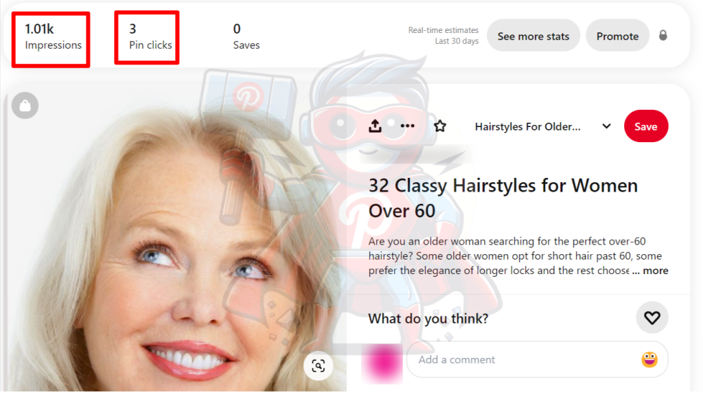
This pin received 1.01k impressions last month, but the pin click rate is only around 0.297% [Pin Click Rate = (Pin Clicks / Impressions) × 100].
The average pin click rate for this type of keyword is between 1% – 1.8%.
So, there is an opportunity to get around 10 – 18 clicks on this pin, but the current design isn’t good enough to achieve that.
Pinterest is a visual platform, and users often scroll the pins quickly. If the pin doesn’t stand out among others, it’s likely to be overlooked.
Now, we will create a new pin design for this keyword.
Since the keyword is about the hairstyles of older women over 60, showing multiple hairstyles will increase the chance of getting noticed by users.
Here is a better pin design for the topic:

This pin design is more likely to get clicked because it features multiple images of stylish women over 60, including celebrities. The inclusion of different hairstyles for short, long, and medium hair, as well as women of different races, makes it appealing to a diverse audience.
The bold headline is easy to read, and the contrasting colors make the text stand out, improving readability and drawing attention to the key message. The “CLICK HERE” button encourages engagement.
We are going to publish this pin today (2nd June 2024) and see if the pin click rate and outbound click rate aka ctr improve.
Pin stat update after 30 days (1st July 2024): The pin got 38.97k impressions, 1.55k Pin clicks, and 889 outbound clicks within 30 days! It means the pin went viral!
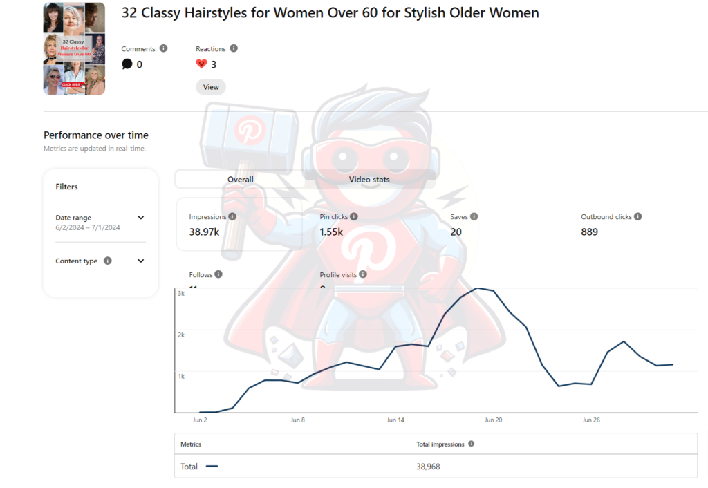
The pin click rate and CTR for this pin are 3.98% and 2.28% which is excellent for this niche.
Comparing the Pin clicks and outbound clicks, more than 50% of people who clicked on the pin were convinced to check the article also. So we can say that the created pin was perfectly optimized and no further A/B testing is needed.
Follow these creative and data-driven steps will help make your pins go viral and get more clicks.
How to Design Pins with Canva
Now you know what to do to get more clicks on your pins. It’s time to design them. The best and easiest app for designing pins is Canva. It is straightforward and user-friendly. Even the free version is also effective for creating professional-looking pins.
If you want to create your pins with Canva, here is the process:
Go to Canva’s website and sign up for an account. If you already have an account, simply log in. On the Canva dashboard, you’ll see a variety of design templates.
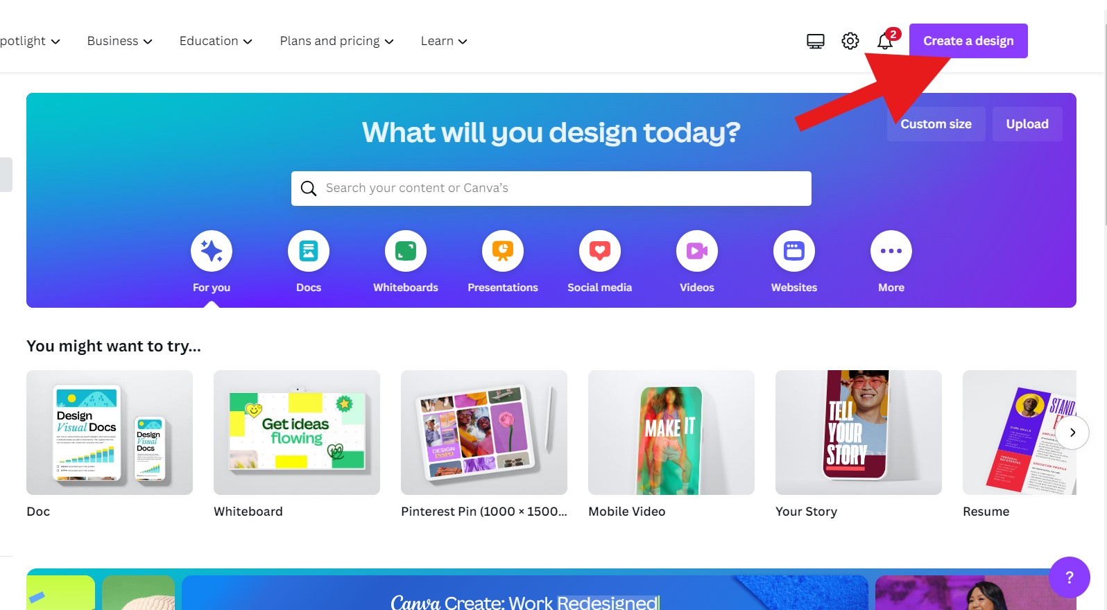
Press the “Create a Design” button in the top right corner. Select the “Pinterest Pin” option or input custom dimensions as 1000 width and 1500 pixels height. A new window will open with a blank design, displaying the following tabs on the screen.
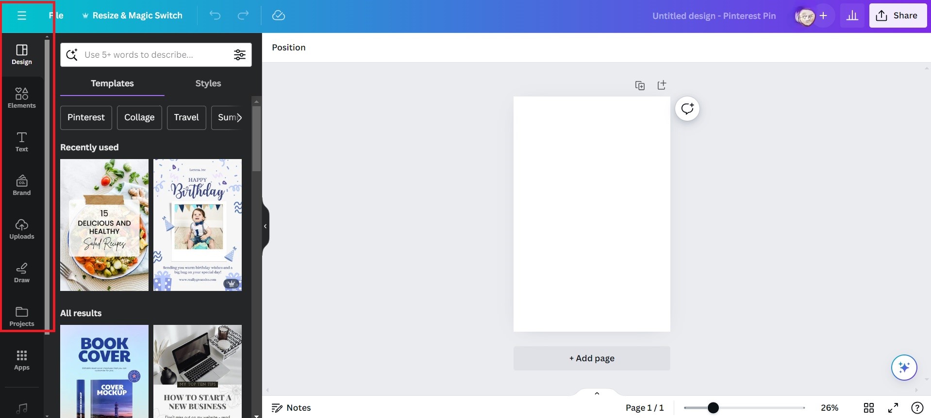
You’ll see a variety of design templates on the design tab. You can either scroll through the options or use the search bar to find specific templates. Now check out what you can do with the template.
Elements: You can add shapes, icons, illustrations, and other graphics to your design from the “Elements” tab.
Uploads: If you have your images or graphics (your own or downloaded from stock), you can upload them to Canva and add them to your design.
Text: Click on the text boxes to edit them. You can change the font, size, color, and alignment of the text.
Layouts: Experiment with different layouts by clicking on the “Layouts” tab. This allows you to rearrange the elements of your design.
Effects: Apply effects like filters, transparency, and shadows to your design.
Use these functions to create your pin. Replace the placeholder text with your own titles, descriptions, and content. Make sure your text is clear, concise, and easy to read. You can also add background from the elements function.
Once you are happy with your design, click on the “Preview” button to see how it looks.
If everything looks good, click on the “Download” button to save your design to your computer.
After making 3 – 4 pins, you will become familiar with the features.
Canva also offers additional features Pro subscription. This includes premium templates, stock photos, and advanced design tools. If you’re serious about creating professional-quality pins, you should consider upgrading to Canva Pro.
So, now you know the tips and tricks to get more clicks with your pin design and how to create professional pins using Canva. Create fresh pins, and publish 1-3 pins on your Pinterest account every day.
If it sounds like too much work for you, check out our monthly management packages for Pinterest. We’ll handle everything for you.
For more queries or customized plans, feel free to mail us at [email protected] or schedule a meeting with us.

